Goss.
Packaging.
Brand.
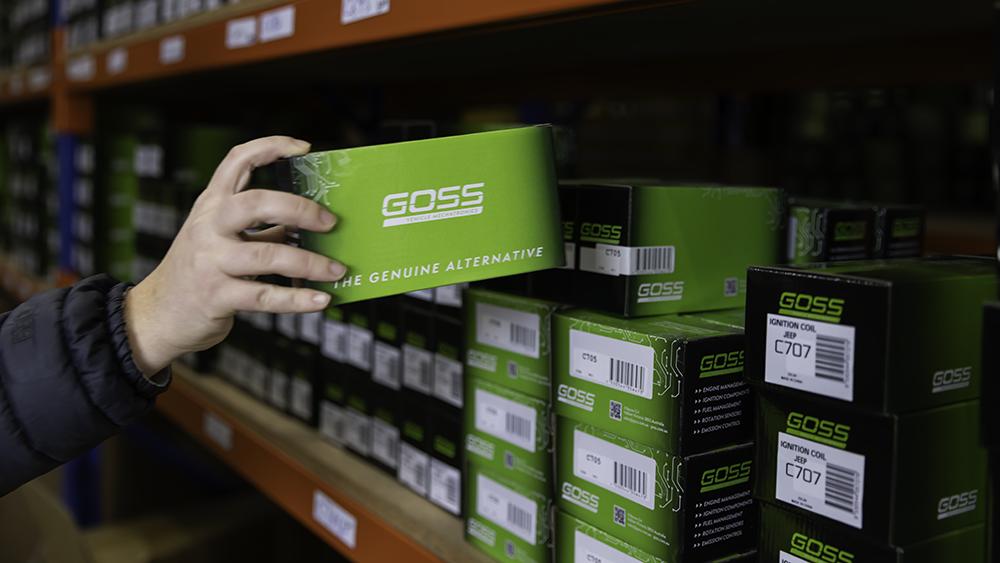
Following the refresh of the Goss brand, the next step was updating the packaging to match. Looking at what competitors were doing, we saw an opportunity to lean into green — a space that wasn’t heavily occupied — and use it to help Goss stand out on the shelf.
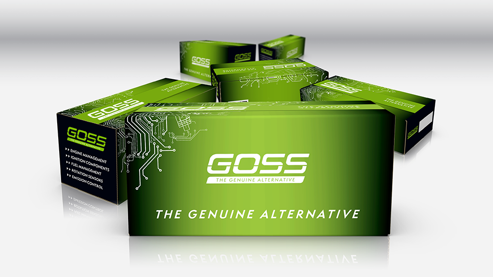
The approach was to keep things simple, clean and consistent across the entire range. With more than 70 different box sizes and formats, there was always going to be complexity, so it was important to establish a system that could scale without losing cohesion.
Working closely with the Goss team, we developed a set of clear guidelines and design principles, then rolled that out across the full packaging suite. Spot colours were used to maintain consistency in the green across different printers and manufacturers, ensuring the brand looked the same no matter where it was produced.
The end result is a strong, cohesive packaging range that’s both visually appealing and practical. It stands out in-store, works across a wide variety of formats, and reinforces the Goss brand wherever it appears.