Hurleys Fly Fishing.
Brand Development.
Brand.
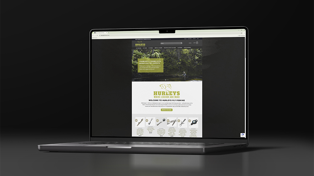
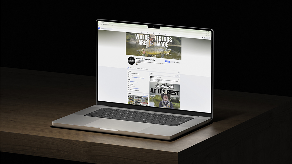
Having worked closely with Gav, the founder of Hurleys Fly Fishing, for years, we were excited when he mentioned it was time for a refresh. The goal wasn’t to reinvent the brand, but to give it a lift — something that felt more modern while still staying true to what people already recognised.
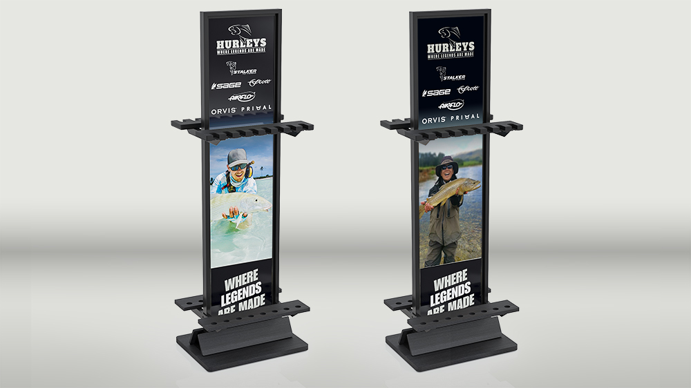
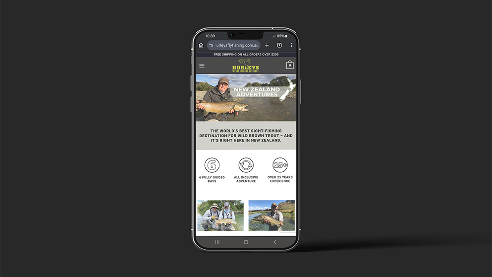
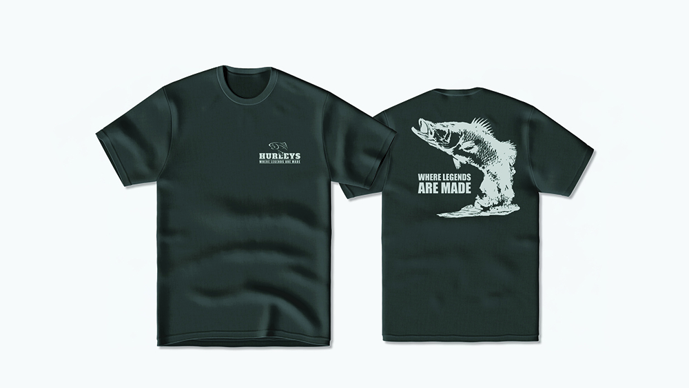
We started by refining the colour palette, keeping things earthy and natural while building on the familiar green that’s been part of the brand for years. From there, we updated the logo typeface, moving towards something bolder and more timeless that would hold its own across different applications.
A key part of the process was retaining the trout element — it’s such a recognisable part of the brand. Rather than removing it, we reworked it to sit more comfortably within the updated design and feel consistent with the new direction.
The result is a refreshed identity that feels clean, current, and still unmistakably Hurleys. A subtle evolution, but one that makes a real difference — and most importantly, a result the client was genuinely happy with.