MAP.
Brand Development.
Brand.
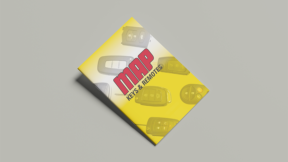
After years of using the original MAP branding, the business decided it was time for an update. The goal wasn’t a complete rebrand, but rather a considered refresh that would bring the identity forward and better reflect where the business is today.
We started by reviewing what was working and what wasn’t. From there, we refined key elements of the brand, strengthening the design to feel more modern, bold and confident, while still holding onto the familiarity that existing customers recognised.
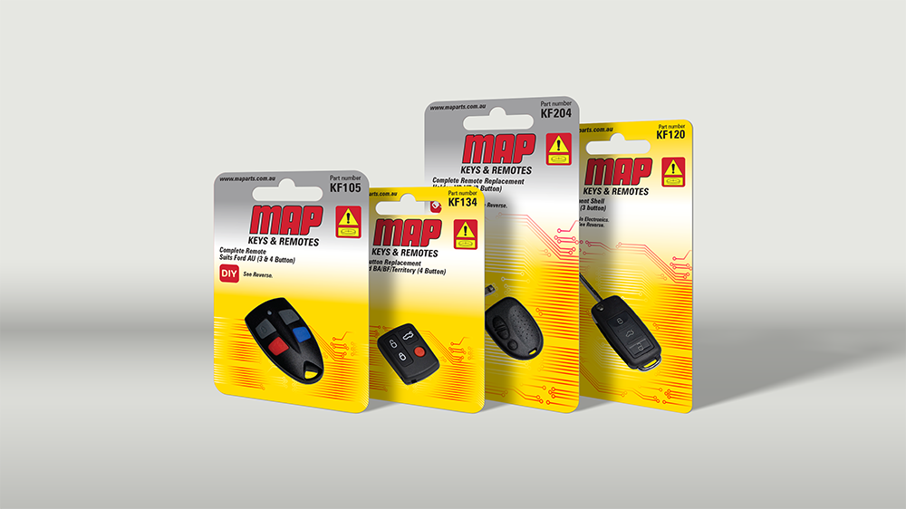
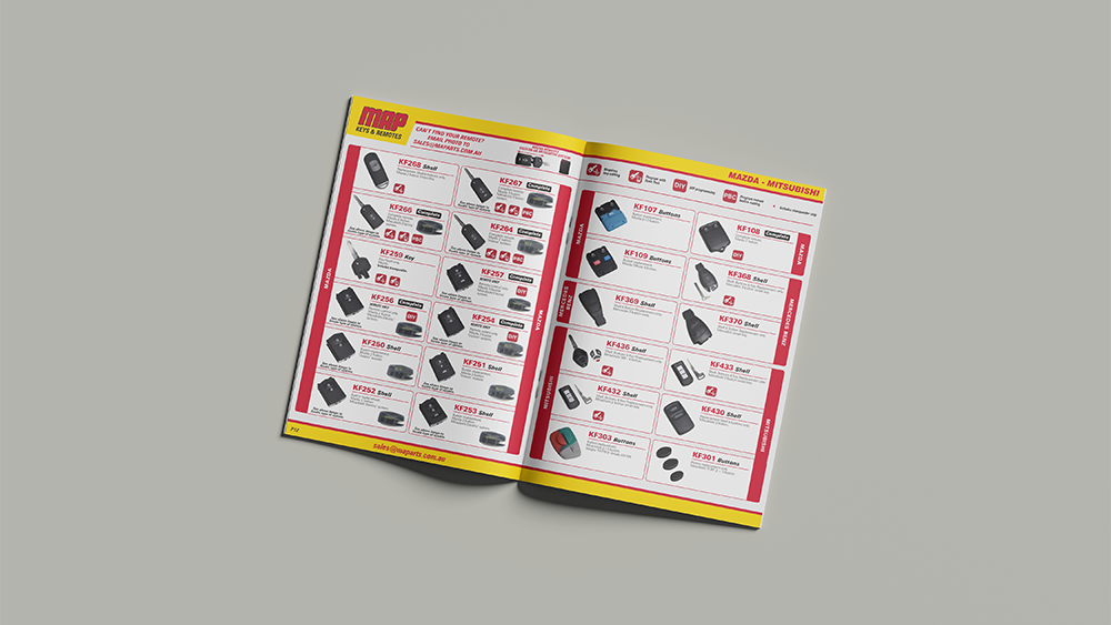
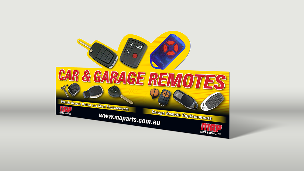
A big part of the process was ensuring the brand worked across real-world applications — particularly on product backing cards, where the logo needed to sit comfortably and remain clear at a glance. The updated identity was built with flexibility in mind, allowing it to adapt across different formats without losing impact.
The end result is a refreshed brand that feels current without losing its roots. It’s a natural evolution — one that strengthens the identity and gives MAP a more confident presence moving forward.